
THE BRAND EDIT · FULL CASE STUDY
Nordenary
Nordenary is My Myrenberg's world of nature experiences in the Nordics—retreats, expeditions, yoga and guiding. It was the first project to travel the full journey of The Brand Edit, from inner clarity to a living digital home.
Year
2026
Focus
The Brand Edit
Role
Strategy, Identity, Digital Home
The Threshold
So much to offer, no clear direction
When My came to me, she carried a picture of who she was supposed to speak to. That picture was quietly keeping her from reaching the people she truly longed to work with. Her ideas were many and scattered, and it was hard to know where to direct her energy.
So we began somewhere else: with what makes My shine. What fills her with energy and joy, what she loves to create—and from that rooted place, step by step, bringing her work into clear, living form.
The Strategic Turn
Presence over adrenaline
As we explored her position, something became clear. Much of the outdoor and guiding world speaks the language of adrenaline, extremes and doing as much as possible. My invites people inward instead—toward presence.
Her work holds a fine balance between challenging yourself and coming back to rest. Through nature, and through meeting a challenge with support, you come closer to yourself and your own strength. A little more wild, a little more true.
We also named one of her rarest gifts: collaboration. My brings together skilled people to create experiences that combine different worlds—like yoga and ceramics.
The Name
Out of the ordinary, in the Nordics
Finding the name was a journey of its own. We explored many directions together, took turns and circled back, with countless ideas and alternatives on the map. In the end, it was My who landed on Nordenary herself—a word rooted quietly in her own world.
It captured everything she offers: experiences truly out of the ordinary, held here in the North. After all the turns and possibilities on the map, the moment it was spoken, it felt completely obvious—as if it had been waiting there all along.
Visual Identity
Stepping into the forest
The identity is built on contrast. Headlines are set in a bold, powerful typeface, while the body text is light and airy.
The palette is meant to feel like stepping into a forest: dark, warm and holding, like sinking into moss, with a few bright elements that spark curiosity. There is challenge and tension, but you are held.
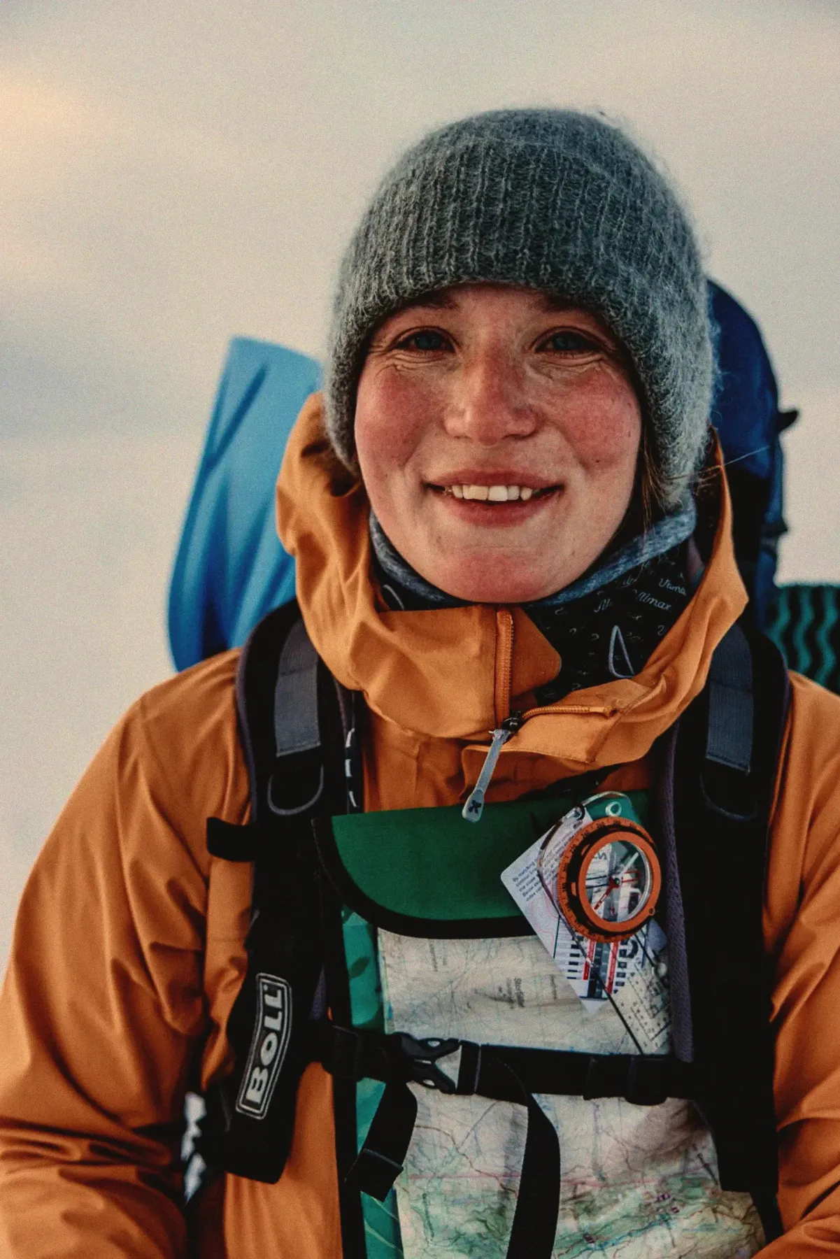
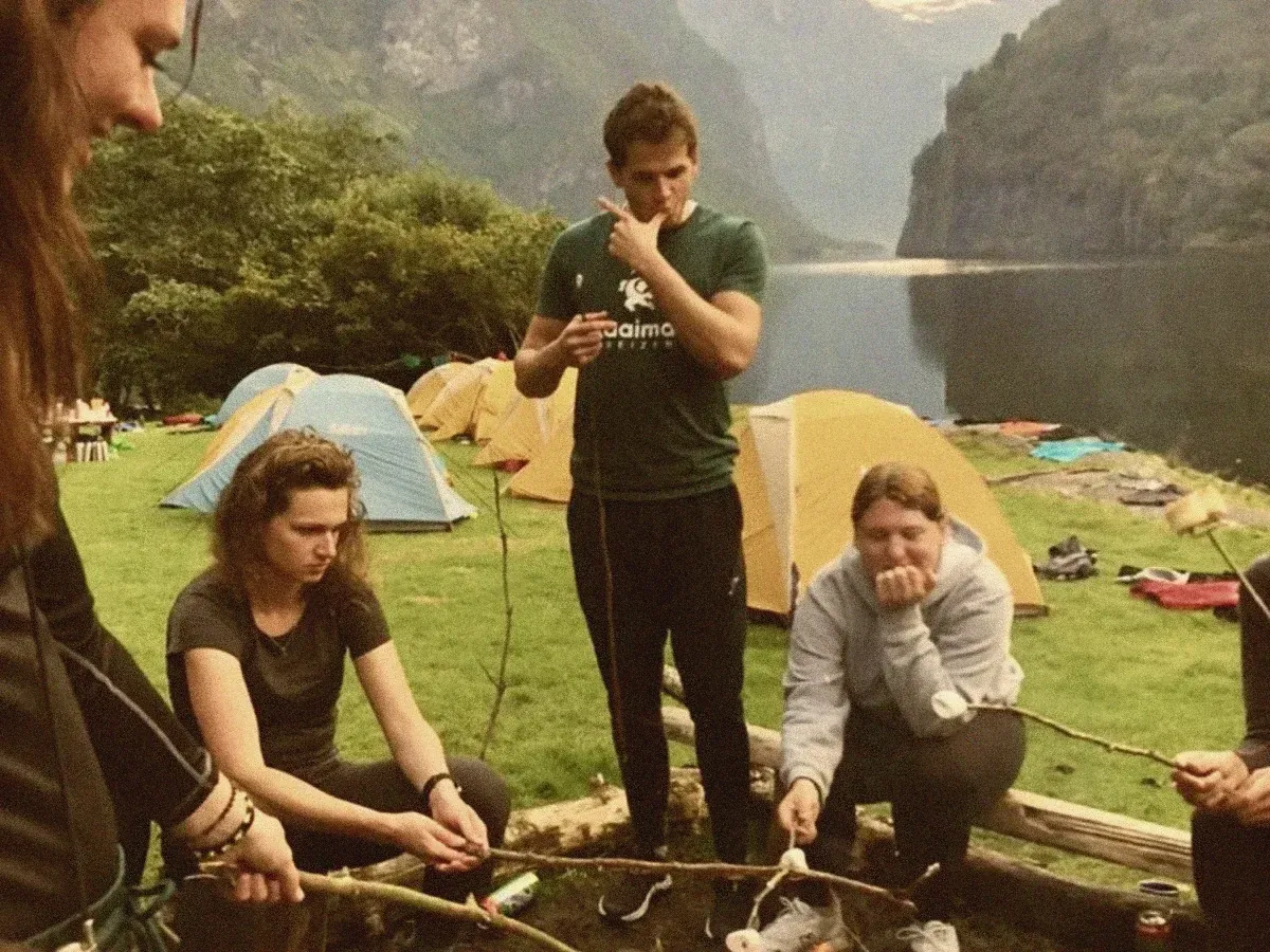
The imagery has a retro touch and is never polished. Instead of action-sport photography, it shows presence, togetherness and community—something raw and real.
The Digital Home
One home for many offerings
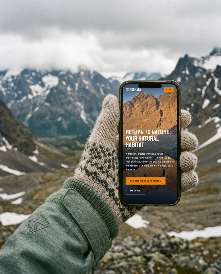
My's toolbox is wide: expeditions, retreats, weekly yoga, rentals, guiding for others and collaborations. The structure of the site gives each of them a clear place, with distinct sections and honest words about who each offering is for.
The start page presents the current main offering, a calendar shows what is coming, and signing up for an experience is simple.
The Outcome
A clear starting point
For My, it was a relief to finally hold something concrete. We worked toward a shared deadline: launching her first offering, a Yoga & Ceramics mini-retreat at Vandrarheimen in Voss, together with her weekly yoga classes—so people could book and reach out.
Built in Lovable, the site is easy to update, change and grow, with AI support to keep it alive. It is not a static presentation but a living home she can always point people to, with current offerings, an up-to-date calendar and every way to collaborate.
Throughout the process, I got to witness My's greatness—her unique way of relating to nature, presence and experience, and how beautifully she collaborates with others. She follows her inner calling and leads by example. It was a true joy to work together.
The Journey
- 01Brand Excavation
- 02Strategic Structure
- 03The Unfolding
- 04The Digital Birth
Deliverables
- The Brand Blueprint
- Visual Language & Art Direction
- Digital Home (Lovable)
Digital Home
nordenary.com